


5 min read
Optimizing images in NextJs applications
Diana Jurić Posted on January 22, 2024
Images in Next.js may pose challenges due to their potential impact on performance, as large or unoptimized images can lead to slower page loads and increased data consumption, emphasizing the importance of optimizing and handling images efficiently in web development.
In the following text, I will walk you through the steps of how to optimize images in Next.js applications using next-image-export-optimizer.
When it comes to optimizing images in Next.js applications, the usual approach involves pre-optimizing images in design tools like Figma. The idea is to avoid optimizing images in Figma and apply styles like border-radius, box shadows, and so on with CSS.
Using Figma for styling images comes with its drawbacks. For example, if we add a box shadow to the image through Figma, the space that the shadow is taking also counts as the whole image size, so we end up having extra space that is harder to style if we have elements around that image, and the image itself seems smaller.
Table of contents
- Next image export optimizer
- Next.js images installation and setup
- Custom Image Component
- So how this library works?
- Importing images in NextJs: Best Practices
Next image export optimizer
With the next-image-export-optimizer, we are adding a step after the Next.js static export.
Optimizing Images in Next.js apps is important for many reasons, and here is what this library provides for us to easily optimize images in our projects:
- Enhances page loading speed and reduces image sizes with responsive images and sharp.js transformations.
- Converts JPEG and PNG files to WEBP format automatically.
- Serves the React bundle through CDN, eliminating the need for a server
- Automatically creates blurry placeholder images
- Requires minimal setup
- Supports remote and animated images
- Defaults image quality setting to 75 with only one global value allowed.
Next.js images installation and setup
Step 1
To get started, install the library using npm, yarn or pnpm
npm install next-image-export-optimizer
# Or
yarn add next-image-export-optimizer
pnpm install next-image-export-optimizer
Step 2
Update your next.config.js file with the following code and change the default values where appropriate (e.g. specify the folder where the images are stored - default is public/images)
module.exports = {
  images: {
    loader: "custom",
    imageSizes: [16, 32, 48, 64, 96, 128, 256, 384],
    deviceSizes: [640, 750, 828, 1080, 1200, 1920, 2048, 3840],
  },
  transpilePackages: ["next-image-export-optimizer"],
  env: {
    nextImageExportOptimizer_imageFolderPath: "public/images",
    nextImageExportOptimizer_exportFolderPath: "out",
    nextImageExportOptimizer_quality: 80,
    nextImageExportOptimizer_storePicturesInWEBP: true,
    nextImageExportOptimizer_exportFolderName: "nextImageExportOptimizer",
    //If you do not want to use blurry placeholder images, then you can set
    // nextImageExportOptimizer_generateAndUseBlurImages to false and pass
    // `placeholder="empty"` to all <ExportedImage> components.
    nextImageExportOptimizer_generateAndUseBlurImages: true,
  },
};
Step 3
Update your export command in package.json
- "export": "next build && next export"
+ "export": "next build && next export && next-image-export-optimizer
Custom Image Component
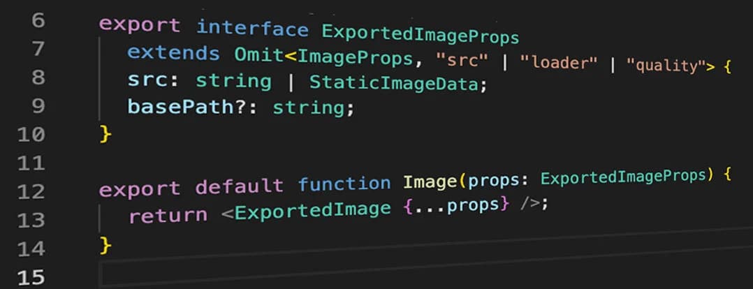
Create a new Image component that will return the ExportedImage component from this library, and use it in the app instead of Image imported from next/Image
import { ImageProps, StaticImageData } from "next/image";
import ExportedImage from "next-image-export-optimizer";
export type { StaticImageData };

export interface ExportedImageProps
  extends Omit<ImageProps, "src" | "loader" | "quality"> {
  src: string | StaticImageData;
  basePath?: string;
}
export default function Image(props: ExportedImageProps) {
  return <ExportedImage {...props} />;
}
So how this library works?
Under the hood, the ExportedImage component wraps around the Image component from Next.js. Through the custom loader, a srcset is generated for various resolutions of the original image. This enables the browser to load the suitable size based on the current size of the viewport.
Srcset is an HTML image attribute that specifies the list of images to use in different browser situations. The browser will pick the most optimal image version, based on the screen size and resolution. So in the exported static React app, the responsive images are available as srcset and dynamically loaded by the browser.
If Next.js images are not generated yet, the component will use the original image.
Importing images in NextJs: Best Practices
Static import of the image is recommended because it informs the client about the original image size. For image sizes larger than the original width, the next largest image size in the deviceSizes array (configured in next.config.js) will be used for the generation of the secret attribute.
For the dynamic imports, this library will create duplicates of the original image for each image size in the deviceSizes array that is larger than the original image size.
Example
import heroImg from "@public/hero.png";
<Image
  className={`rounded-xl ${heroImageShadow}`}
  src={heroImg}
  layout="responsive"
  priority={true}
  alt="hero"
/>;
Here is an example of how we use the Image component in our app.
- layout=”responsive” (scales the image to fit the width of its parents container)
- priority (to disable lazy loading)
- placeholder (a placeholder to use while the image is loading, defaults to “empty”)
Import images that are in .png or .jpeg format, and the library converts it to .webp by default
After we’re done with adding new images or replacing the existing ones, we run the export command (npm run export - defined in package.json) and the next-image-export-optimizer does its magic :)


